0. Titanic 케라스 이용하여 풀어보기
- https://www.kaggle.com/antmarakis/beginner-keras-and-visualization-tutorial 의 번역본입니다. 오역은 알려주세요!!
- https://www.kaggle.com/melonicedlatte/beginner-keras-and-visualization-tutorial 에서 실제 커널에서 돌아간 것을 확인할 수 있습니다.
1. Introduction(소개)
In this tutorial we will use the popular Deep Learning library,
Keras, and the visualization librariesMatplotlibandSeabornto build a classifying simple model. The librariesNumpyandPandaswill help us along the way.
이 튜토리얼에서 우리는 유명한 딥러닝 라이브러리 ‘keras’, 시각화 도구 ‘matplotlib’, 간단한 모델의 분류를 하기 위한 ‘seaborn’ 을 사용할 것입니다. 라이브러리 ‘numpy’와 ‘pandas’ 도 도움이 될 것입니다.
2. Data (데이터)
First, we will load our dataset using
pandas.
먼저, 우리는 ‘pandas’를 이용하여 데이터를 불러올 것입니다
import pandas as pd

train_x = pd.read_csv("../input/titanic/train.csv", sep=',')
test_x = pd.read_csv("../input/titanic/test.csv", sep=',')
Before we do anything else, let’s see what our data looks like:
뭔가를 하기 전에, 데이터가 어떻게 생겼는지 보겠습니다.
train_x.head(5)
| PassengerId | Survived | Pclass | Name | Sex | Age | SibSp | Parch | Ticket | Fare | Cabin | Embarked | |
|---|---|---|---|---|---|---|---|---|---|---|---|---|
| 0 | 1 | 0 | 3 | Braund, Mr. Owen Harris | male | 22.0 | 1 | 0 | A/5 21171 | 7.2500 | NaN | S |
| 1 | 2 | 1 | 1 | Cumings, Mrs. John Bradley (Florence Briggs Th... | female | 38.0 | 1 | 0 | PC 17599 | 71.2833 | C85 | C |
| 2 | 3 | 1 | 3 | Heikkinen, Miss. Laina | female | 26.0 | 0 | 0 | STON/O2. 3101282 | 7.9250 | NaN | S |
| 3 | 4 | 1 | 1 | Futrelle, Mrs. Jacques Heath (Lily May Peel) | female | 35.0 | 1 | 0 | 113803 | 53.1000 | C123 | S |
| 4 | 5 | 0 | 3 | Allen, Mr. William Henry | male | 35.0 | 0 | 0 | 373450 | 8.0500 | NaN | S |
Looks good.
We will now start thinking of which of these features we will use in our model. Also, since we can see some missing values, we will need to tidy our data up too. First, let’s see how many rows have missing values:
좋습니다.
우리는 이제 우리의 모델에 이러한 특징들을 사용할 생각을 해봅시다. 또한, 데이터 중에는 값이 들어가지 않은 데이터가 있기 때문에, 우리는 데이터를 정돈해야 합니다. 먼저 값이 들어가지 않은 데이터가 얼마나 많은지 보겠습니다.
train_x.isnull().sum()
PassengerId      0
Survived         0
Pclass           0
Name             0
Sex              0
Age            177
SibSp            0
Parch            0
Ticket           0
Fare             0
Cabin          687
Embarked         2
dtype: int64
Indeed there are some values missing from ‘Age’, ‘Cabin’ and a couple of rows in ‘Embarked’. We will take care of them after we pick our features. For now, let’s visualize some data!
실제로, ‘나이’, ‘객실’, ‘승선위치’ 값이 없는 데이터가 있습니다. 특징들을 고른 후에 이런 것들을 다뤄 보겠습니다. 지금은 먼저 시각화를 해보죠!
3. Visualization(시각화)
To visualize our data, we will use
matplotlibandseaborn.
Intuitively, it makes sense that the class of the passenger (‘Pclass’) would play a big role in the passenger’s survival. The same probably holds true for the sex of the passenger. If I remember correctly, in the movie Titanic we see that the ladies were embarking the lifeboats first.
Let’s see if these hypotheses are correct:
시각화 하기 위해서, ‘matplotlib’와 ‘seaborn’을 사용할 것입니다.
직관적으로 ‘자리등급(1등석, 2등석…)’이 생존에 영향을 크게 미쳤을 것 같습니다. 또, 성별도 그렇습니다. ‘영화 타이타닉’ 에 보면은 여성을 구명보트에 먼저 태우는 것을 볼 수 있습니다.
import seaborn as sns
import matplotlib.pyplot as plt

sns.barplot(x="Pclass", y="Survived", data=train_x);
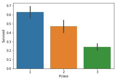
From the above data we can see that more than 60% of 1st class passengers survived, while less that 30% of 3rd class did. Let’s keep this in mind, ‘Pclass’ so far seems like a good estimator.
Now to check the sex:
위의 데이터에서 보는 것처럼 60% 이상의 1등석의 승객들이 살았고, 30% 미만의 3등석 승객들이 사망했습니다. 좌석등급은 매우 좋은 측정지표입니다.
sns.barplot(x="Sex", y="Survived", data=train_x);
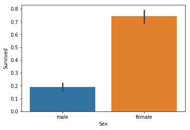
Titanic stands true, it seems. Ladies indeed got in the lifeboats first, with about 70% of them surviving, while men only had a 1 in 5 chance of survival.
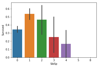
Let’s now take a look at features like the number of siblings and spouses (‘SibSp’) and the type of the relationship (‘Parch’)’. These do not seem to be that relevant, but better to be safe than sorry.
타이타닉 영화는 진짜인 것으로 보여집니다. 여성은 실제로 구명보트에 먼저 타서 70% 이상이 생존한 반면 남자는 20% 정도만 생존했습니다.
이제 ‘형제/자매/배우자의 숫자’와 ‘부모/자식의 숫자’ 특징(==속성==컬럼)을 살펴보겠습니다. 크게 관련이 없어보이지만, 실제로 확인해보는 것이 안전하겠죠?
sns.barplot(x="SibSp", y="Survived", data=train_x);
sns.barplot(x="Parch", y="Survived", data=train_x);
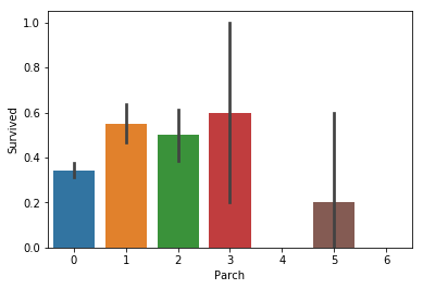
Something does seem to be going on with ‘SibSp’, but the differences are small so to keep our feature set small we will skip it. For ‘Parch’, there doesn’t seem to be a connection.
The ‘Ticket’ feature seems to be comprised of random alphanumericals, so we will skip it too.
Next we will take a look at ‘Age’. Intuitively it makes sense to use this as a feature, since it is likely that they let elders reach the lifeboats alongside women and children.
‘형제/자매/배우자의 숫자’에는 어떤 특성이 있는 것처럼 보이지만, 차이가 매우 미미하기 때문에 우리가 사용할 특성들을 최소한으로 하기 위해서 우리는 이러한 특성을 사용하지 않을 것입니다. ‘부모/자식의 숫자’를 보면, 전혀 연관성이 보이지 않습니다.
‘티켓’ 특징은 영어와 숫자가 섞여있기 때문에, 사용하지 않겠습니다.
그 다음에 우리가 볼 속성은 ‘나이’ 입니다. 직관적으로 ‘나이’를 사용하는 것은 바람직해보이는데, 노인들이 여성과 아이들과 함게 구명 보트에 생존할 수 있는 가능성이 높아 보이기 때문이죠.
sns.barplot(x="Age", y="Survived", data=train_x);
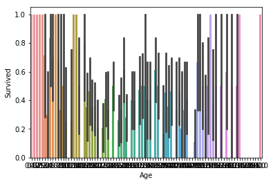
Unfortunately, it is a bit hard to visualize ages the way we did the rest of the features, since we have a lot of different samples. Here we can see that ages on both ends of the spectrum seem to fare better, but we need to get a closer look. We will ‘bin-ify’ the ages, grouping them to bins according to their value. So, ages closer together will appear as one and it will be easier to visualize.
The function we will use will round the ages within a factor. To make our lives easier, we will use
numpy.NOTE: We pass as argument not the array itself, but its (deep) copy because we don’t want the values of the dataset itself to be changed.
불행하게도, 나이는 값이 많기 때문에 기존 방법처럼 시각화 하는 것은 조금 어렵습니다. 우리는 위의 그래프에서 양극단의 스펙트럼이 더 나아보이지만, 더 자세히 봐야할 필요가 있습니다. 우리는 나이를 그들의 값에 따라서 비슷한 값을 묶어주는 ‘bin-ify(상자화)’를 할 것입니다. 그러면, 붙어있는 나이는 하나로 보일 것이고 시각화 하기 편해질 것입니다.
import numpy as np

def make_bins(d, col, factor=2):
    rounding = lambda x: np.around(x / factor)
    d[col] = d[col].apply(rounding)
    return d

t = make_bins(train_x.copy(True), 'Age', 7.5)
sns.barplot(x="Age", y="Survived", data=t);
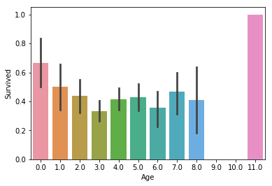
In the above case we round the ages up to a factor of
7.5, and aside from the elders making it through, we don’t get much information. Maybe we round too much? Let’s try a smaller value:
위의 그래프에서는 7.5를 이용하여 값을 나눈 후에 반올림 했습니다. 이 정보에서는 연장자 이외에 더 많은 정보를 얻을 수가 없습니다. 우리가 너무 많이 나눈 것일까요? 더 작은 값을 사용해보겠습니다.
t = make_bins(train_x.copy(True), 'Age', 5)
sns.barplot(x="Age", y="Survived", data=t);
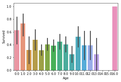
There doesn’t seem to be much correlation to survival rate, except on the opposite ends of the spectrum. Maybe age didn’t play much of a role after all.
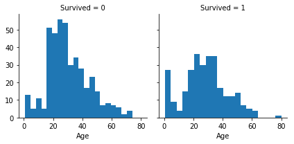
Note that instead of creating the function
make_bins, we could have used one ofseaborn’s functions:
양 극단을 제외하고는 생존률과는 큰 관계가 없어보입니다. 아마도 나이는 큰 역할을 하지 않았나 봅니다.
‘make_bins’ 메소드를 사용하는 것 대신에 ‘seaborn’ 의 함수를 사용할 수도 있습니다.
g = sns.FacetGrid(train_x, col='Survived')
g.map(plt.hist, 'Age', bins=20);
For ‘Fare’, we will use the same,
make_bins, method:
‘요금’을 ‘make_bins’ 메소드를 사용해서 분석할 수 있습니다.
t = make_bins(train_x, 'Fare', 10)
sns.barplot(x="Fare", y="Survived", data=t);
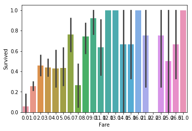
Even though small prices don’t have much chance of surviving, the top prices seem to correlate to survivability at random. Still, we need to investigate this further in case there is some value to ‘Fare’. If we listen to our instincts, it seems reasonable that a high fare means better passenger class. Maybe this is how ‘Fare’ ties in to survivability.
비록, 저렴한 비용이 많이 생존하지 못했다고 하더라도, 비싼 가격에서의 생존률은 랜덤으로 보여집니다. 여전히, 우리는 ‘요금’에 대해서 더 조사해야할 필요가 있습니다. 직관적으로 보자면, 승객의 좌석이 요금이 비쌀수록 더 좋다는 것은 합리적으로 보여집니다. 아마도 이것이 ‘요금’과 생존률과 왜 관계가 있는지 말할 것입니다.
sns.barplot(x="Pclass", y="Fare", data=t);
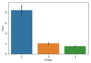
Indeed, the 1st class is more expensive, which makes sense. So, even though it seems that ‘Fare’ is not such a terrible indicator, after we snooped around we revealed that ‘Fare’ was ‘Pclass’ in disguise. Since we want to reduce dimensionality as much as possible, we will only use ‘Pclass’ and drop ‘Fare’.
We have one more feature remaining, ‘Embarked’:
실제로, 1등석이 더 비싸고 그것은 당연합니다. 비록 ‘요금’이 그렇게 최악의 지표는 아닌 것처럼 보일지라도, 우리가 조금 살펴본후에 우리는 ‘요금’이 ‘좌석등급’의 다른 형태인 것을 알게 되었습니다. 우리는 가능한 차원을 낮추고 싶기 때문에, ‘좌석등급’만 사용하고 ‘요금’은 제외할 것입니다.
sns.barplot(x="Embarked", y="Survived", data=train_x);
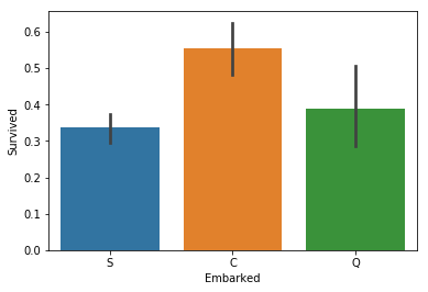
It does seem that those that embarked from ‘C’ have a higher chance of survival, so maybe we need to look further into this. Maybe the different embarkation points have different prices and that is what makes ‘C’ stand out.
‘C’에서 승선한(Cherbourg) 사람들이 더 많이 생존한 것으로 보여집니다. 따라서, 이것에 대하여 더 살펴보겠습니다. 아마도, 다른 승선 위치는 다른 가격들을 가지고 있을 것이고, 이것이 ‘C’가 두드러지는 이유일 것입니다.
sns.barplot(x="Embarked", y="Fare", data=train_x);
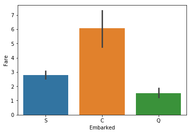
As we can see, the port correlates to the fare, which is ‘Pclass’ in disguise. Thus, we can safely drop this feature as well to reduce computational strain.
우리가 볼 수 있듯이, 항구는 요금과 관련되어 있고, 이것은 ‘좌석등급’의 또 다른 형태라고 볼 수 있습니다. 그러므로, 우리는 쉽게 승선위치라는 특징을 제거하여 계산의 부하를 줄일 수 있습니다.
3.1. Adding a feature of our own(우리가 만든 특징을 더해주기)
Before we continues, let’s consider another route. What if we were to create a feature of our own using data from above? In a lot of cases, this can be useful.
Remember that there is still a feature we haven’t used: ‘Name’. It doesn’t really make much sense to use it, since a name cannot possibly be a factor in one’s survival. But let’s take a closer look, there is something interesting hiding between the lines…
계속하기 전에, 다른 방법을 생각해보시죠. 위 데이터를 사용하여 우리 자신의 기능을 생성한다면 어떨까요? 많은 경우에, 이것은 유용합니다.
우리가 아직 사용하지 않은 특징이 있습니다. ‘이름’입니다. 이름은 사용하기에 많은 도움이 될 것 같지 않습니다. 이름이 그 사람의 생존의 원인이 될 수 없으니까요. 하지만 세심하게 살펴본다면, 숨어있는 흥미로운 특징이 있습니다.
train_x.head(3)
| PassengerId | Survived | Pclass | Name | Sex | Age | SibSp | Parch | Ticket | Fare | Cabin | Embarked | |
|---|---|---|---|---|---|---|---|---|---|---|---|---|
| 0 | 1 | 0 | 3 | Braund, Mr. Owen Harris | male | 22.0 | 1 | 0 | A/5 21171 | 1.0 | NaN | S |
| 1 | 2 | 1 | 1 | Cumings, Mrs. John Bradley (Florence Briggs Th... | female | 38.0 | 1 | 0 | PC 17599 | 7.0 | C85 | C |
| 2 | 3 | 1 | 3 | Heikkinen, Miss. Laina | female | 26.0 | 0 | 0 | STON/O2. 3101282 | 1.0 | NaN | S |
Notice how the ‘Name’ column holds not only the actual name, but the title of the person too (‘Mr.’, ‘Mrs.’, etc.). That sounds kind of useful. Surely a lord of sorts would get in the lifeboats earlier, right? Let’s see if that hypothesis is true.
First we will need to extract that information. Thankfully,
pandasallows us to quickly parse a dataset using regular expressions.
‘이름’이 단순히 실제 이름이 아니라, ‘Mr’, ‘Mrs’와 같은 글자도(이것을 타이틀이라고 부르겠습니다) 포함합니다. 이것은 매우 유용합니다. 확실하게 귀족이 구명 보트에 더 먼저 탑승할 것 입니다. 이러한 가설이 실제로 맞는지 확인해보시죠.
먼저, 우리는 정보를 추출해야 합니다. ‘pandas’는 정규 표현식을 사용할 수 있기 때문에 빠르게 파싱할 수 있습니다.
train_x['Title'] = train_x.Name.str.extract(' ([A-Za-z]+)\.', expand=False)
We extracted all the titles from the ‘Name’ column, using a regular expression that matches parts of the field that start with a space and end with a period.
Below we can see how many times each title appears.
우리는 이름에서 타이틀(Mr, Mrs)을 추출할 수 있습니다. 공백으로 시작하고 마침표로 끝나는 필드의 부분과 일치하는 정규식을 사용하여 ‘이름’ 열에서 모든 제목을 추출했습니다.
우리는 얼마나 많은 타이틀이 있는지 아래에서 확인할 수 있습니다.
train_x['Title'].value_counts()
Mr          517
Miss        182
Mrs         125
Master       40
Dr            7
Rev           6
Mlle          2
Col           2
Major         2
Sir           1
Ms            1
Lady          1
Jonkheer      1
Mme           1
Don           1
Capt          1
Countess      1
Name: Title, dtype: int64
The top four values appear a lot, while the rest don’t appear that often. We need to clean this up, since that many different values may cause some trouble. We will merge the values that appear the least amount of times into a new title, called ‘Rare’.
We will also merge ‘Ms’ and ‘Mlle’ to ‘Miss’, since we know that they all mean the same thing, and ‘Mme’ to ‘Mrs’ for the same reason.
상위 4개의 값이 가장 많지만, 나머지는 거의 나타나지 않습니다. 우리는 거의 나타나지 않는 값을 제거해줘야합니다. 제거해주지 않으면 몇 가지 문제를 발생시킬 수 있기 때문이죠. 우리는 ‘Rare’라는 이름으로 최소 횟수로 나타나는 값을 새로운 제목으로 만들겠습니다.
우리는 ‘Ms’와 ‘Mlle’를 ‘Miss’로 통합할 것입니다. 우리는 이러한 요소들이 동일한 요소인지 알기 때문입니다. ‘Mme’를 ‘Mrs’로 바꾸는 것도 동일한 이유입니다.
train_x['Title'] = train_x['Title'].replace(['Lady', 'Countess','Capt', 'Col', 'Don',\
                                             'Dr', 'Major', 'Rev', 'Sir', 'Jonkheer', 'Dona'],\
                                             'Rare')
train_x['Title'] = train_x['Title'].replace('Mlle', 'Miss')
train_x['Title'] = train_x['Title'].replace('Ms', 'Miss')
train_x['Title'] = train_x['Title'].replace('Mme', 'Mrs')
Let’s now see if ‘Title’ is a good indicator:
‘타이틀’이 좋은 속성이 되는지 확인해보겠습니다.
sns.barplot(x="Title", y="Survived", data=train_x);
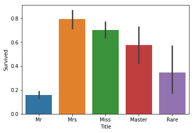
It seems that we do get a bit more information. Whereas men generally didn’t survive, those that had the title ‘Master’ did at almost 60%. There were also men that survived at a higher rate with a ‘Rare’ title. Thus, this seems like a good feature to add to our model.
Now we just need to convert these values to numerical, so that we can use them to fit our model. The little snippet of code that does this is the following:
우리는 추가로 정보를 더 얻은 것 같습니다. 남자는 일반적으로 살아남지 못한 반면에, ‘Master(귀족)’ 타이틀을 가지고 있는 사람은 거의 60%가 생존했습니다. ‘Rare’ 타이틀을 가진 남성은 조금 더 생존하였습니다. 그러므로, 이러한 특성은 우리 모델에 더하는 것이 좋을 것 같습니다.
우리는 이제 이러한 값들을 숫자 형태로 바꿔야 합니다. 우리의 모델에 맞게 하기 위해서이죠. 이걸 실행하기 위한 간단한 코드는 아래와 같습니다.
_, train_x['Title'] = np.unique(train_x['Title'], return_inverse=True)
train_x['Title'].head(10)
0    2
1    3
2    1
3    3
4    2
5    2
6    2
7    0
8    3
9    3
Name: Title, dtype: int64
3.2. Features to Pick (선택해야 할 특징들)
From the above results, we see that ‘Pclass’ and ‘Sex’ are good indicators, while ‘Age’ is so-so. In our model, we will pick the good indicators plus the feature we just created, ‘Title’. If the results are not that good, we may consider adding ‘Age’ in the mix and seeing what comes out (note: I did use ‘Age’, and the results did not improve; in some models they even got worse).
Onward to cleaning our data!
위의 특성들에서, 우리는 ‘좌성등급’과 ‘성별’이 좋은 구분자인 것을 확인했습니다. 반면에 ‘나이’는 별로였죠. 우리 모델에서는, 우리는 좋은 구분자로써 우리가 만든 ‘타이틀’ 이라는 속성을 추가할 것입니다. 만약 결과가 그다지 좋지 않다면, 우리는 나이를 더할 것을 고려할 것이고 무엇이 나오는지 확인해 볼 것입니다.(참고 : 이미 ‘나이’ 속성을 사용해 봤지만, 성과는 좋아지지 않았습니다. 몇가지 모델에서는 심지어 나빠지기도 했습니다.)
4. Cleaning Up (정돈하기)
Now that we picked the features we want to use, we need to clean up our dataset.
First, we will drop the features we will not need:
이제 우리는 우리가 원하는 특징들을 선택하기 위해서, 데이터셋을 정돈할 것입니다.
먼저, 우리는 필요 없는 데이터 컬럼을 제거할 것입니다.
train_x.drop(['SibSp', 'Parch', 'Ticket', 'Embarked', 'Name',\
        'Cabin', 'PassengerId', 'Fare', 'Age'], inplace=True, axis=1)
Next we will drop the null values:
다음으로 우리는 null 값을 모두 제거할 것입니다.
train_x.dropna(inplace=True)
Finally, we also need to convert ‘Sex’ to numerical values:
이제, 우리는 ‘성별’ 특징을 숫자로 바꿔야 합니다.
_, train_x['Sex'] = np.unique(train_x['Sex'], return_inverse=True)
With that out of the way, we need to separate our dataset into features and target (the target in this case is ‘Survived’). That way we can input the features into the model and compare the result to the corresponding target. Also, the target list should be a 1D array, which is the form Keras requires.
우리는 데이터를 특징과 타겟(=목적=결과값=표적, 타겟은 ‘생존’입니다)에 따라서 분리해야 합니다. 그러한 방식으로 우리는 특징들을 모델안에 넣을 수 있고, 일치하는 타겟의 결과를 비교할 수 있습니다. 또한, 타겟 리스트가 1D 차원 배열이여야 합니다. keras가 그러한 데이터 형식을 원하기 때문입니다.
train_y = np.ravel(train_x.Survived) # Make 1D
train_x.drop(['Survived'], inplace=True, axis=1)
And voila! Our dataset is ready. Let’s build our Keras model.
데이터 셋이 준비되었습니다. 케라스 모델을 만들어봅시다!
5. Keras Model (케라스 모델)
The model we will built, as well as most Keras models, will be
Sequential.We know that since the problem is a binary classification problem, we will need a sigmoid outer layer. Before that, we will add two fully-connected (
Dense) layers that useReLUas their activation function.
우리가 만드는 모델은 많은 케라스 모델과 마찬가지로, ‘Sequential(연속적)’ 입니다
우리는 문제가 이진 분류인 것을 알기 때문에, 우리는 sigmoid 레이어를 사용해야 합니다. 그 전에, 우리는 2개의 fully-connected 레이어를 Relu 활성화 함수를 사용하여 추가했습니다.
from keras.models import Sequential
from keras.layers import Dense

model = Sequential()

model.add(Dense(16, activation='relu', input_shape=(3,)))
model.add(Dense(8, activation='relu'))
model.add(Dense(1, activation='sigmoid'))
Using TensorFlow backend.
Next we will compile our network. We have two target classes, so we will use the binary cross-entropy loss function. the
adamoptimizer is a good default gradient-descent option, and the metric will be the humble accuracy.
다음에 우리는 네트워크를 컴파일 할 것이다. 우리는 두 개의 타겟층이 있고, 그렇기 때문에 이진 크로스 엔트로피 손실 함수를 사용합니다. ‘adam’ 옵티마이저가 경사 하강법 옵션에서의 기본적인 옵션으로 좋은 성능을 발휘합니다. 그리고 metric(평가기준)은 ‘accuracy’를 사용합니다.
model.compile(loss='binary_crossentropy',
              optimizer='adam',
              metrics=['accuracy'])
Only thing that remains is to fit our model with the given data:
이제 남은 일은 우리의 모델을 주어진 데이터에 대하여 fit(학습)시키는 것입니다.
model.fit(train_x, train_y, epochs=50, batch_size=1, verbose=1)
Epoch 1/50
891/891 [==============================] - 1s 1ms/step - loss: 0.7175 - accuracy: 0.6038
Epoch 2/50
891/891 [==============================] - 1s 1ms/step - loss: 0.5533 - accuracy: 0.7183
Epoch 3/50
891/891 [==============================] - 1s 1ms/step - loss: 0.4903 - accuracy: 0.7767
Epoch 4/50
891/891 [==============================] - 1s 1ms/step - loss: 0.4653 - accuracy: 0.7935
Epoch 5/50
891/891 [==============================] - 1s 1ms/step - loss: 0.4600 - accuracy: 0.7890
Epoch 6/50
891/891 [==============================] - 1s 1ms/step - loss: 0.4566 - accuracy: 0.7868
Epoch 7/50
891/891 [==============================] - 1s 1ms/step - loss: 0.4522 - accuracy: 0.7879
Epoch 8/50
891/891 [==============================] - 1s 1ms/step - loss: 0.4456 - accuracy: 0.7856
Epoch 9/50
891/891 [==============================] - 1s 1ms/step - loss: 0.4427 - accuracy: 0.7935
Epoch 10/50
891/891 [==============================] - 1s 1ms/step - loss: 0.4415 - accuracy: 0.7991
Epoch 11/50
891/891 [==============================] - 1s 1ms/step - loss: 0.4387 - accuracy: 0.7879
Epoch 12/50
891/891 [==============================] - 1s 1ms/step - loss: 0.4383 - accuracy: 0.7901
Epoch 13/50
891/891 [==============================] - 1s 1ms/step - loss: 0.4339 - accuracy: 0.8002
Epoch 14/50
891/891 [==============================] - 1s 1ms/step - loss: 0.4357 - accuracy: 0.7901
Epoch 15/50
891/891 [==============================] - 1s 1ms/step - loss: 0.4349 - accuracy: 0.7924
Epoch 16/50
891/891 [==============================] - 1s 1ms/step - loss: 0.4347 - accuracy: 0.7969
Epoch 17/50
891/891 [==============================] - 1s 1ms/step - loss: 0.4344 - accuracy: 0.7811
Epoch 18/50
891/891 [==============================] - 1s 1ms/step - loss: 0.4329 - accuracy: 0.7912
Epoch 19/50
891/891 [==============================] - 1s 1ms/step - loss: 0.4324 - accuracy: 0.7924
Epoch 20/50
891/891 [==============================] - 1s 1ms/step - loss: 0.4303 - accuracy: 0.7868
Epoch 21/50
891/891 [==============================] - 1s 1ms/step - loss: 0.4306 - accuracy: 0.7991
Epoch 22/50
891/891 [==============================] - 1s 1ms/step - loss: 0.4311 - accuracy: 0.7901
Epoch 23/50
891/891 [==============================] - 1s 1ms/step - loss: 0.4332 - accuracy: 0.7856
Epoch 24/50
891/891 [==============================] - 1s 1ms/step - loss: 0.4302 - accuracy: 0.8013
Epoch 25/50
891/891 [==============================] - 1s 1ms/step - loss: 0.4312 - accuracy: 0.7912
Epoch 26/50
891/891 [==============================] - 1s 1ms/step - loss: 0.4287 - accuracy: 0.7969
Epoch 27/50
891/891 [==============================] - 1s 1ms/step - loss: 0.4296 - accuracy: 0.8002
Epoch 28/50
891/891 [==============================] - 1s 1ms/step - loss: 0.4313 - accuracy: 0.7868
Epoch 29/50
891/891 [==============================] - 1s 1ms/step - loss: 0.4263 - accuracy: 0.8070
Epoch 30/50
891/891 [==============================] - 1s 1ms/step - loss: 0.4292 - accuracy: 0.7879
Epoch 31/50
891/891 [==============================] - 1s 1ms/step - loss: 0.4254 - accuracy: 0.8013
Epoch 32/50
891/891 [==============================] - 1s 1ms/step - loss: 0.4309 - accuracy: 0.7946
Epoch 33/50
891/891 [==============================] - 1s 1ms/step - loss: 0.4316 - accuracy: 0.7834
Epoch 34/50
891/891 [==============================] - 1s 1ms/step - loss: 0.4274 - accuracy: 0.7912
Epoch 35/50
891/891 [==============================] - 1s 1ms/step - loss: 0.4307 - accuracy: 0.7912
Epoch 36/50
891/891 [==============================] - 1s 1ms/step - loss: 0.4290 - accuracy: 0.7924
Epoch 37/50
891/891 [==============================] - 1s 1ms/step - loss: 0.4289 - accuracy: 0.7969
Epoch 38/50
891/891 [==============================] - 1s 1ms/step - loss: 0.4308 - accuracy: 0.7868
Epoch 39/50
891/891 [==============================] - 1s 1ms/step - loss: 0.4291 - accuracy: 0.7879
Epoch 40/50
891/891 [==============================] - 1s 1ms/step - loss: 0.4277 - accuracy: 0.7845
Epoch 41/50
891/891 [==============================] - 1s 1ms/step - loss: 0.4254 - accuracy: 0.8025
Epoch 42/50
891/891 [==============================] - 1s 1ms/step - loss: 0.4286 - accuracy: 0.7834
Epoch 43/50
891/891 [==============================] - 1s 1ms/step - loss: 0.4255 - accuracy: 0.7991
Epoch 44/50
891/891 [==============================] - 1s 1ms/step - loss: 0.4273 - accuracy: 0.7980
Epoch 45/50
891/891 [==============================] - 1s 1ms/step - loss: 0.4264 - accuracy: 0.8013
Epoch 46/50
891/891 [==============================] - 1s 1ms/step - loss: 0.4288 - accuracy: 0.7879
Epoch 47/50
891/891 [==============================] - 1s 1ms/step - loss: 0.4284 - accuracy: 0.7834
Epoch 48/50
891/891 [==============================] - 1s 1ms/step - loss: 0.4277 - accuracy: 0.7980
Epoch 49/50
891/891 [==============================] - 1s 1ms/step - loss: 0.4275 - accuracy: 0.7912
Epoch 50/50
891/891 [==============================] - 1s 1ms/step - loss: 0.4278 - accuracy: 0.7823


<keras.callbacks.callbacks.History at 0x7ffad349e898>
We seem to have about 80% accuracy on our training data. Quite probably this will drop a bit in the test data, but it seems good enough for our little model.
Let’s now prepare the testing dataset, similarly to how we prepared the training one.
NOTE: If you want to save the weights, you can execute this line:
model.save_weights('weights.h5').
우리의 traing 데이터는 80%의 정확도를 보여줍니다. 확실히, 아마 test 데이터에서는 약간 더 떨어지겠지만, 작은 모델에서는 충분해 보닙니다.
이제 testing 데이터셋을 준비합니다. training 데이터를 준비한 것처럼요.
*주의 : weight를 저장하고 싶으면, model.save_weight(‘weights.h5’) 명령어를 사용해야합니다.
to_test = test_x.copy(True)

# Add Title
to_test['Title'] = to_test.Name.str.extract(' ([A-Za-z]+)\.', expand=False)
to_test['Title'] = to_test['Title'].replace(['Lady', 'Countess','Capt', 'Col', 'Don',\
                                                'Dr', 'Major', 'Rev', 'Sir', 'Jonkheer', 'Dona'],\
                                                'Rare')
to_test['Title'] = to_test['Title'].replace('Mlle', 'Miss')
to_test['Title'] = to_test['Title'].replace('Ms', 'Miss')
to_test['Title'] = to_test['Title'].replace('Mme', 'Mrs')

_, to_test['Title'] = np.unique(to_test['Title'], return_inverse=True)

# Clean Data
to_test = to_test.drop(['SibSp', 'Parch', 'Ticket', 'Embarked', 'Name', 'Cabin',\
                        'PassengerId', 'Fare', 'Age'], axis=1)
_, to_test['Sex'] = np.unique(test_x['Sex'], return_inverse=True)
Note that since we are going to need the id of the passengers for our submission, we need to copy
test_xto a temporary dataset. If we made the changes totest_xdirectly, we would losePassengerId, since we drop it.Finally it is time to test our model!
우리가 passengers의 id를 제출할 때 사용해야 되기 때문에, 우리는 ‘test_x’를 임시 데이터셋으로 복사해야 된다는 것을 기억하세요. 만약 우리가 ‘test_x’데이터 셋을 직접 변경한다면, 우리는 ‘passengerId’ 속성을 전부 잃어버리게 됩니다.
predictions = model.predict_classes(to_test).flatten()
predictions[:5]
array([0, 0, 0, 0, 0], dtype=int32)
To make our lives easier, we flattened the array. We also show the first five values. Only thing we need to do is write this to a
.csvand submit it:
더 쉽게 하기 위해서, 배열을 평평하게 해야 합니다. 우리는 5개의 값을 볼 수 있습니다. 우리가 해야 할 일은 .csv 파일에 적어 넣은 뒤에 제출하는 것입니다.
submission = pd.DataFrame({
    "PassengerId": test_x["PassengerId"],
    "Survived": predictions
})
submission.to_csv('submission.csv', index=False)
6. Conclusion (결론)
And that is all.
We visualized our data, found the best features to use, created a feature of our own, build our model and submitted our results. Even though the model is quite simple, it gave about 75% accuracy on the test. Not bad for the little buddy.
You might be thinking that we could increase the results by adding more layers, neurons and epochs. Maybe, but this was my initial approach and I can tell you it didn’t work that well. That is because the dataset is quite small and my bigger model overfit. So, I went back to a simpler model and I found that the results were better.
So, bigger is not always better when it comes to Deep Learning models.
이것이 전부입니다.
데이터를 시각화하고, 좋은 특징을 찾고, 우리만의 특징을 만들고, 모델을 만든 뒤에 결과로 제출했습니다. 비록 모델이 간단하더라도, 75%의 테스트 정확도를 보여줍니다. 작은 친구에게는 문제가 되지 않습니다.
아마도 레이어, 뉴런, epoch을 늘린 결과를 늘릴 수 있다고 생각할 수 있습니다. 아마도, 그것은 저의 첫 진입 방식이었지만 생각보다 잘 되지 않았습니다. 데이터가 작기 때문에 거대한 모델은 overfitting 되기 때문입니다. 그래서, 단순한 모델로 돌아가고 결과가 더 좋아졌습니다.
딥러닝에서는 거대한 모델이 항상 좋은 모델이 아닙니다.